Stephen Holloway's Media Arts
A blog dedicated to my Grade 11 Media Arts Class
Monday, January 24, 2011
Cubism
This next assignment required the creation of a cubism picture. Instead of using multiple angles of one picture to create the image, I decided to use two similar objects to create one. For this I used my two dogs. I first took a picture of both of my dogs looking at the camera. I then removed the background of the image because I wanted the focus on the blending of the two dogs, not the kitchen that they were in at the time. To create the image I outlined the background with the lasso tool and erased it. I then selected random parts of both dogs with the square select tool, then copied and pasted on to new layers. After creating a sufficient amount of random squares, I put them together like a puzzle but with no correct placement for the pieces. I like this image, but that is biased because it consists of my dogs.
Monday, January 17, 2011
Multicultural Festival
I first collected a group of flags that I thought best showed the variety that the world holds. I then made a layer of the dark aqua colour that I thought was a great colour to compliment all the different colours on the flags. I then selected the heart shape and deleted the colour inside to make it look as thought the flags are creating the heart. I then made the shapes around the heart with the line tool and filled them with a lighter blue colour. I think all the colours on this poster go well together and compliment each other just like all the cultures on this earth, we compliment each other in varying ways.
Friday, January 7, 2011
My thoughts My expressions My poetry...
Sometimes telling someone how you feel isn't enough. Poetry is all about expression and emotion, and the life of being a teenager is definitely filled with emotion. Poetry is a powerful output to express the way you feel, and gives you the ability to influence others just by writing a few words. The reason for the cover that I created was to express the powerful emotion found in poetry, especially that which is found in a teenager's writing. Reading last year's poetry was surprising for me. I didn't realize the varying emotions that were so present in the students of this school, especially the most common which seems to be poems dealing with sadness. In other words "teen angst", which is the main reason for the almost depressing colour choices. Although I have two main images on my page, the subdued effect on the limp rose brings out the main focus of the page, the fairy. I chose a picture not showing any expression on the face to show how much body language can affect how you believe people feel, yet there is no way to prove how someone is feeling. This is the reason I chose the particular picture of this fairy. No one can prove how she is feeling, she may have a smile on her face but it is hidden by her arms. Teenagers do this all the time, they hide their real emotions by acting happy yet they may be very sad, but writing poetry can let them show how they truly feel through words, because sometimes it's just too challenging to show how you feel towards others. Hopefully, in some way, teenagers can understand that if they truly showed how they feel, they will see that it's okay to be themselves and express themselves towards other people.
Thursday, December 16, 2010
More Photos Restored
Monday, December 13, 2010
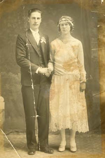
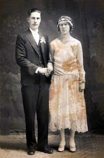
Photos Restored
 |
| BEFORE |
 |
| AFTER |
During class, Jenna and I decided to restore the same photo. Here is the result of my photo restoration. What I did for the restoration was, I first used the clone tool to remove all the imperfections. Then I used auto-contrast, auto-colour, and auto-darken. I then went into colour adjust and changed the darkness of the picture by myself. I really like how different the two photos look, and I think I did a good job! (and so did Jenna :)
Monday, November 8, 2010
Patterns, Lines, and Shapes...ABSTRACT
 | |
| FOLLOW THE TREND |
 |
| EMPTY MIND |
 | |
| ORIGAMI |
The first image is titled 'Follow The Trend', it represents how if one person starts a trend almost everyone will follow. It's almost like an epidemic. This picture represents my point of view which is sort of off to the side, because I try not to get caught up in things like this. Different sized arrows, represent different sized people. I tried to keep a simple colour palette with the arrows obviously being a standout feature. I first selected a grey and white colour and used a gradient for the background. I then selected the arrow shape and stamped it in different sizes, also making sure they are also different layers. I then selected the paint bucket and filled in the arrows with white, grey, and red.
The second image is called 'Empty Mind'. To be completely honest I'm not too fond of this one, and the shapes in this picture are mostly just too fill the very empty space that the original background seemed to create. Yet the hard edge gradient, I really like. It gives the illusion that something is almost in sight, almost like it's in misty clouded water. Which is part of the title meaning. The very empty space represents how empty the mind can be yet there is always something, no matter how small it is, going on. That is represented by the hard edge poking through the misty area. For some reason a word I think of when looking at this picture is 'quiet' and I feel it is the best word to express the feeling in this picture. This picture simply involved a hard edge gradient, and a square shape that is in different sizes. I dropped the opacity and altered the sizes of each. The colours I chose are analogous to each other. Since the colours are adjacent to each other on the colour wheel the image is a lot more pleasing and relaxing to the eye, rather than having a harsh contrast of perhaps an orange colour.
The last, and my favourite picture, is called 'Origami'. I think this is my best one because I found some inspiration for the picture. Even though it is abstract, it can still be a picture of something, it just has to look more natural and harder to identify. This may come as a surprise but this image is inspired by a piece of clothing. The Origami dress by Thierry Mugler. This image is basically the elements of the dress displayed in an abstract image. There are the diamond shapes that represent the origami on the dress and the blocks of colour going towards the diamonds show how beautifully the light reflects off the dress. This picture consists of using the gradient tool with a black and white for the background. Then drawing hard edged shapes with the lasso tool,, making sure they are on different layers. Then finally filling in the shapes with different shades of beige, yellow and white to show lighting in an abstract manner. I really like this image, yet I didn't really enjoy this assignment. Let's not do this again, o.k.? Cool.
Wednesday, October 27, 2010
Overlaying My Face
 | |
| Before |
 |
| Starry Eyed |
 | |
| Before |
 | ||
| Cracked Mind |
My next image is called "Cracked Mind". It represents when people hide their sadness behind a happy face. The clouds represent when people use the expression that they are on cloud nine, meaning that they are ecstatic. Yet some people hide how they really feel to avoid a confrontation about it. The cracked face, represents the sadness that still shows through the happiness. I first cropped the image of my face, and repeated the process of making my eye a new layer. I decided to keep my eye how it was because I thought my eye colour looked really cool. I then placed a picture of clouds over my face, erased what was covering my eyebrows and then warped the image. I then placed the cracked texture over the entire image, erased what was covering the black parts of the image, then lastly warped the image to make it look like it's on my face. I thought this project was kind of cool, but hasn't beat out the surrealism which is still at number one.
Subscribe to:
Comments (Atom)


