Monday, September 20, 2010

Sky Blue Eyes

I had already completed the black and white assignment so I decided to do something in class. I found another picture of Sky Ferreira, simply because I couldn't think of any other person to use. I went to filter and picked dark strokes. Before that, though, I made and new layer of her eyes and changed the colour to a light blue. I did this quite fast but I like the way it turned out.
BEFORE
AFTER

Sunday, September 19, 2010

Product Of Insomnia

BEFORE

Self-concious Cyborg Sky
I can't sleep right now so I decided to do a quick piece. I found a picture I like of Sky Ferreira an up and coming singer. I noticed she was covering her face. It looked like she was trying to cover something up. So I thought why not actually have her cover something up? So I decided that she would have half a robot face but she is self-concious so she tries to cover it. I adjusted the brightness and contrast many times on different areas of the face to achieve this look. I also erased part of her face and put the cyborg face behind it so just a little bit shows. I changed the colour of her hair, lips, eyes, eye-shadow, and bracelet. I also added some shadows on one side of her face to give it a darker look. I also went to filter and adjusted the sharpness. It's not the best because I did it really quick, but it's cool anyway. I think I'll go to bed now.

Friday, September 17, 2010

Black and White

"Victory"
"Honour"

Our next assignment was to create black and white photo compositions that have the topic of "Back To School". My first photo I named "Victory". When I first exited the classroom to find a place to take photographs I immediately thought the trophy case. I saw the angel and thought it would be a unique photo because some people might not figure where it comes from. I named it "Victory" because the angel is on top of a trophy, and winning seems to be an important thing to students. Whether it is having the better grade or coming first in a sport's tournament someone always wants to win. I also threw in the angel because we are in a catholic school. By achieving the effect that I have on this picture I first cropped the picture because there was too much empty space surrounding the focus, then went to "Enhance" then clicked "convert to black and white". After turning the picture to black and white I went to "Filter" and went through the list of different effects. I came upon "cutout" which I love and thought it gave an awesome effect. I dropped the detail to make it look almost like separate shapes stuck onto a background. I then raised both brightness and contrast, which is how I achieved this look.
My next picture is called "Honour". As I walked around the school I kept looking at the walls to see if there was anything that stood out as something that could be associated with back to school. I noticed this plaque with a crusader in it and thought that it was perfect. I called it "Honour" because people are proud to be called a crusader, so what better way to honour this outlook by using this picture. I first converted to black and white by repeating the steps that I used with my first picture. I then noticed that you can alter the effects. I was looking for an effect that looked like the photo had been drawn. I went back to cutout and adjusted the "Number of levels", and "Edge simplicity" after finding that none of the effects sufficed. I found that dropping the "Edge simplicity" made it look like just like I imagined. I am very pleased with these two photographs and discovered that if I keep my photos simple they are more effective.

Wednesday, September 15, 2010

Vamp'd

VAMPIRE GAGA

BEFORE
I have recently completed my own project of turning Lady Gaga into a bloodsucking vampire. I took a picture of Lady Gaga and first adjusted the colours by selecting specific parts of the picture with the lasso tool. I then got a background of a gloomy forest and placed that behind her by simply dragging the picture on to my project straight from the internet. After that I cut, copied, and pasted the mouth from the "True Blood" logo and placed that over Gaga's own lips. I noticed the fang was too small to see from a distance so I found a picture of a vampire and copied and pasted a fang from that picture. The fang was a bit yellow so I raised the contrast to make it look brighter, then lowered the brightness on the top of the tooth to make it look like it's actually in her mouth. I then got a picture of smoke, I lowered the brightness and made it transparent. I then made a copy of the smoke, flipped it horizontally and placed it in front of Gaga, just to add to the mysterious theme of the picture. After placing all the elements I adjusted the colour of Gaga so she blended better with the rest of the elements. After all that hard work I finished by lowering the brightness of certain features of her face such as her cheekbones and the sides of her nose to give her more of a gaunt, undead kind of look. I love how this picture turned out, I hope you do too.

A New Kid At Lourdes


This assignment involved blending faces together to create a new student. This assignment was quite challenging, especially having to make the new features look like part of the original face. My new kid is called Lauren and she is very smart. She has memorized the periodic table, she knows all the dates for all important events in history, and she can solve any math problem you give her, in her head. She sounds like an excellent student who would be getting the best grades in school, but she's not. She puts no effort into anything she does, because she just can't be bothered.
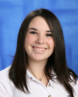
BEFORE
I used Taylor's face as a base. I erased the eyes and mouth to replace with new features. I then pasted Jenna's eyes on to the image and made them look seamless. After replacing the eyes I copied and pasted Jill's mouth, being careful to make the smile look natural by putting the corners of the mouth by the smile creases in the face. I decided to change the hair colour so I adjusted the colour to a natural red colour. I then shortened the hair. I found this to be challenging. Having to erase all the hair and still make it look as real as I can was difficult. I then used the collar off of Jose's image, and the Lourdes symbol off of Nick's shirt because Taylor's hair was covering it in the original picture. I am very pleased with my final result, and if Lauren was real, we'd be BFF's!
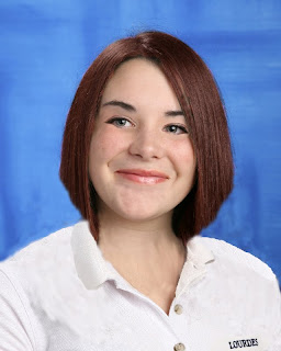
AFTER

Tuesday, September 14, 2010

Coming Soon...

Before

Current Progress
I am currently working on a project of my own at home. I do not have Photoshop but a program that is very similar and in some ways, I feel, a lot better.  I am taking the above picture of Lady Gaga and turning her into a full-fledged bad-a** vamp! The picture to the right is my current progress. I hope you are just as excited as I am to see the finished product!

Friday, September 10, 2010

Imagination Is Everything...


I love artwork that sparks imagination. Something that is a little left of centre. I think odd is beautiful when it comes to artwork. Colour is also very important. Whether there is a lot of colour or hardly any colour at all, it becomes a main part of whether I like a picture or not. These three pictures are the album artwork of english singer/songwriter Paloma Faith. I consider these three pictures to be art. They are imaginative and colourful just like the person that is featured in all three pictures, whose artistic expression is also a big part of her music (which I highly recommend).

Mr. (Mrs.?) Potato Head

Our first assignment was to get used to photoshop by creating our own Mr.Potato Head so we can become accustomed to the tools. I had Comm. Tech last year so I was used to using photoshop and completed this assignment with ease and confidence in my abilities. I am satisfied with my result. Some elements of my creation were taken from other pictures so that it can be unique. I made the facial features bigger to give her more of an animated look rather than realistic(although that is impossible considering her head is an egg). Overall I am pleased with this assignment and had fun doing it, and I am looking forward to our next assignment on Monday.

Wednesday, September 8, 2010

First Class Responses

This blog is for my media arts class. I will be posting on this blog throughout the semester.

Answers To The Questions 
First and foremost, I make art for myself. I draw things that I like, and use colours and elements that I want to see in artwork. I'm interested in a career involving graphic design, and I want to learn as much as I can to acheive this goal.
After looking at Josh Summers' artwork during class I was interested and inspired in media arts even more. I liked his artwork. He brings elements together that you would never see in the real world. I like artwork that shows something that would never happen, something outside of the norm.

"No great artist ever sees things as they really are. If he did, he would cease to be an artist."- Oscar Wilde
I agree with Oscar Wilde's quote. You have to see things in your own way to be able to express your view on what you are seeing.