Thursday, December 16, 2010

More Photos Restored

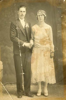
BEFORE
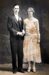
AFTER

Another photo that I restored. The only different thing I did to this photo was, I had to copy and paste her shoulder onto as new layer and recreate a shoulder where it was missing from the rip.

Monday, December 13, 2010

Photos Restored

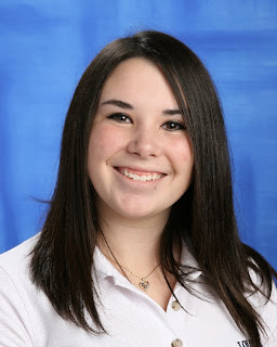
BEFORE
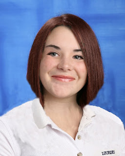
AFTER

During class, Jenna and I decided to restore the same photo. Here is the result of my photo restoration. What I did for the restoration was, I first used the clone tool to remove all the imperfections. Then I used auto-contrast, auto-colour, and auto-darken. I then went into colour adjust and changed the darkness of the picture by myself. I really like how different the two photos look, and I think I did a good job! (and so did Jenna :)

Monday, November 8, 2010

Patterns, Lines, and Shapes...ABSTRACT

FOLLOW THE TREND
EMPTY MIND
ORIGAMI
This next assignment involved creating abstract images in Photoshop. To be honest I actually found this quite challenging. I am used to manipulating photos and creating art pieces that are composed of one or more images. Starting off with a blank slate was quite intimidating, but alas here are three creations that I made and how I made them.
The first image is titled 'Follow The Trend', it represents how if one person starts a trend almost everyone will follow. It's almost like an epidemic. This picture represents my point of view which is sort of off to the side, because I try not to get caught up in things like this. Different sized arrows, represent different sized people. I tried to keep a simple colour palette with the arrows obviously being a standout feature. I first selected a grey and white colour and used a gradient for the background. I then selected the arrow shape and stamped it in different sizes, also making sure they are also different layers. I then selected the paint bucket and filled in the arrows with white, grey, and red.
The second image is called 'Empty Mind'. To be completely honest I'm not too fond of this one, and the shapes in this picture are mostly just too fill the very empty space that the original background seemed to create. Yet the hard edge gradient, I really like. It gives the illusion that something is almost in sight, almost like it's in misty clouded water. Which is part of the title meaning. The very empty space represents how empty the mind can be yet there is always something, no matter how small it is, going on. That is represented by the hard edge poking through the misty area. For some reason a word I think of when looking at this picture is 'quiet' and I feel it is the best word to express the feeling in this picture. This picture simply involved a hard edge gradient, and a square shape that is in different sizes. I dropped the opacity and altered the sizes of each. The colours I chose are analogous to each other. Since the colours are adjacent to each other on the colour wheel the image is a lot more pleasing and relaxing to the eye, rather than having a harsh contrast of perhaps an orange colour.
The last, and my favourite picture, is called 'Origami'. I think this is my best one because I found some inspiration for the picture. Even though it is abstract, it can still be a picture of something, it just has to look more natural and harder to identify. This may come as a surprise but this image is inspired by a piece of clothing. The Origami dress by Thierry Mugler. This image is basically the elements of the dress displayed in an abstract image. There are the diamond shapes that represent the origami on the dress and the blocks of colour going towards the diamonds show how beautifully the light reflects off the dress. This picture consists of using the gradient tool with a black and white for the background. Then drawing hard edged shapes with the lasso tool,, making sure they are on different layers. Then finally filling in the shapes with different shades of beige, yellow and white to show lighting in an abstract manner. I really like this image, yet I didn't really enjoy this assignment. Let's not do this again, o.k.? Cool.

Wednesday, October 27, 2010

Overlaying My Face

Before
Starry Eyed


Before
Cracked Mind

 This assignment involved an overlay over our own face to create an image. My first image is called "Starry Eyed". I named it this because when I daydream I sort of look out of it, or starry eyed. Looking up into an infinite space. I achieved this image by cropping the picture to an interesting size. I then created a new layer by selecting my eye with the lasso tool, making sure it feathers the pixels so the edges aren't too sharp. I then changed my eye colour to a purple/blue to compliment the space colours, and raised the contrast of the whites of my eyes. I then chose a high quality image of space and placed over my face. I lowered the opacity, so you can see my face, and then erased the areas that were covering the darkened parts of the picture. Then I warped the image to make it look like it's actually on my face. Then I turned back on the layer that I had with my eye and placed it over the top of the image.

My next image is called "Cracked Mind". It represents when people hide their sadness behind a happy face. The clouds represent when people use the expression that they are on cloud nine, meaning that they are ecstatic. Yet some people hide how they really feel to avoid a confrontation about it. The cracked face, represents the sadness that still shows through the happiness. I first cropped the image of my face, and repeated the process of making my eye a new layer. I decided to keep my eye how it was because I thought my eye colour looked really cool. I then placed a picture of clouds over my face, erased what was covering my eyebrows and then warped the image. I then placed the cracked texture over the entire image, erased what was covering the black parts of the image, then lastly warped the image to make it look like it's on my face. I thought this project was kind of cool, but hasn't beat out the surrealism which is still at number one.

Album Covers


I was finished the surrealism project and before we got the assignment I had nothing to do. So I made some album artwork for Lady Gaga, because I am seeing her live next march (no big deal!). All I did was get some images off of gagallery.com which has a bunch of hq photoshoots and such. I then cropped the images and added her name and the name of one of her songs on to the image.

p.s. on the first image I added a paint filter on it, and the second one has an abstract background that I placed behind her after cutting out the background from the original image.

Wednesday, October 20, 2010

Unreal Surrealism

"TEMPUS FUGIT"
This assignment involved creating a surrealism picture similar to those of Salvador Dali. My picture is titled 'Tempus Fugit' which is Latin for 'Time Flies'. I decided to show how time can escape us so quickly, without us even realizing it. In my picture it shows how time flies literally, and symbolically. The clock in the sky with wings represents time literally flying through the air. The next is how the woman is being born from the egg, yet she is already grown, and time seems to be melting away in her hands. The lampposts represent a child, a grown up, and an old person. It shows how we go through transformations as we age, and it seems to go by so fast, represented by how close they are to each other. I did a lot of stuff to this picture so be prepared for a lot of writing.
First I selected a dark beach for my ground. I selected the sky with the lasso tool and erased it. I then got a picture of a sky that looks sort of menacing because of the dark clouds near the top.I noticed that the clouds in the sky were sort of yellow, so I went to enhance and altered the colour of the ground by increasing yellow. When I was looking for an egg, I decided to do something a little different so I chose a Faberge egg. (I realize that there is supposed to be a clock on the egg, but that was a sacrifice I was willing to make to use the egg that I chose) I then separated part of the egg by copying and pasting part of the egg, and erasing that same part from the original image. Then I drew shadows facing away from the light coming from the clouds. I then copied and pasted the parts of the egg, flipped them horizontally,lowered the opacity, and warped them so they look like reflections. Then I used a brush tool and painted and smudged at the bottom of the egg so it looks like it's embedded in the wet sand. I then got the picture of the girl and the watch she is holding. I selected her dress with the lasso and changed the colour from blue to yellow so it compliments the egg. I put her behind the egg layer and drew some shadows on the bottom of her dress and away from the light. I then altered the colour of the watch, then warped the watch so it looks like it's melting. I put it over her hand, then made a new layer with her hand in it so it looks like she is holding it. I then put in the reflection similar to the egg.  Next I got the lampposts. I coloured the inside so it looks like it's shining light, and where I placed it on the picture I brightened the ground so it looks like the ground is being lit up. I copied and pasted the lamps, and altered the size. I then warped the last one. After that I made reflections like I did to the egg. I put a clock in the sky, then used a brush tool with grey, and low opacity, and painted over parts of the clock. I then smudged it in so it looks like fog. Then I found some wings that are originally supposed to be a brush tool, but I just got the image, altered the colour, and did the fog effect that I did to the egg.
I'm sure I missed some stuff because I did a lot to this picture, but I definitely got most of it down. This has got to be my favourite assignment so far. I loved doing this and I hope that shows in my picture.

Monday, October 11, 2010

Silkscreens Andy Warhol Style

My Three Silkscreen Images
These are the finished three images of my Andy Warhol style silkscreens. I first took a picture of myself, purposely having the light shine on one side of my face to create the effect that I wanted in the image. After putting it on the computer, I then cropped the picture and lightly smudged the surfaces of certain parts of the picture at a rate of 18% to create the smooth lighting that I achieved in the final images. After cutting out the background I created a new layer for the background colour. After that I selected my image and selected threshold. The main three colours I chose were green, pink, and orange. I first picked the light green so I decided to keep all the colours light to compliment it well. After I chose the green I thought of complimentary colours. I thought red would be too much for the light green so I went with orange, it is still a warm colour yet it's a calmer colour. Red compliments green well so after picking the orange, I also chose a light pink. I chose pink because I felt that having the orange and pink together would compliment green just as well as having the red with it. After placing the three main colours I hand drew lighting on my face from where I thought the light shone on my face the most. The fourth colour in each image is simply a lighter version of the main face colour. I am very pleased with my finished products and I really liked doing the silkscreen project. I will probably do some more of my own in the future, just for fun. :)

Monday, October 4, 2010

Advent Posters for Keeping Christ in Christmas pt.2

HAIL MARY


GOD WATCHES OVER US
Here are the posters to go with the write ups in the previous post.

Friday, October 1, 2010

Advent Posters for Keeping Christ in Christmas pt.1

This next assignment involved creating a poster for the school board to use for 'Keeping Christ in Christmas'. The school board will be using posters from Lourdes this year. I created two posters to submit for selection. The following is the write up for my two posters.

Advent Poster 1- Hail Mary            
When I first thought of Christmas I thought of how important it is to the Catholic community. I wanted to show a picture of someone praying because Christmastime is a time to thank God for our blessings and the birth of our Jesus Christ. Having Mary in this picture was also important because she is the pure woman who gave birth to Jesus. I first started by selecting the entire image and adjusting the brightness and contrast to my preference. I then typed the words that I wanted to place in the picture then arranged them. I decided to change the font colour of the words 'Christ' and 'Christmas' because I feel they are the two most important words in the image. After arranging the words to the selected areas. I found that the image of Mary was washed out, and you couldn't see her face. I selected her with the magnetic lasso tool then selected adjust colour and darkened the shadows, to show the features of the statue better than before. I then filtered the picture with the dark stroke adjustment. I am pleased with this picture, and I feel it brings across the message that we need to remember around the holidays.

Advent Poster 2- God Watches Over Us 
This next poster includes an image of St.Joseph's Church. I used this picture because it shows that Jesus is always with us and watching over us. Sometimes we forget that Christmastime is a time to reflect and thank God for what we have. This image of Jesus also symbolizes that he is always in our minds no matter what. We may forget sometimes but when we enter a church, that is the one person who we thank and pray to. I also included Mr. Macpherson in this photo because he reminds us that we should thank God and always have him in our hearts, I thought that this was a very thoughtful and important message. I first selected the entire picture went to colour adjust, and increased the amount of blue. I then typed in the font and changed them to white to show up against the background, but made sure to keep away from the windows because they washed out the words. I  then readjusted where the words were placed in the picture. Then I adjusted the picture by going to 'filter' and selecting 'cutout'. I am pleased with this simple yet meaningful poster. I hope that it brings the message to others to 'Keep Christ in Christmas'.

Monday, September 20, 2010

Sky Blue Eyes

I had already completed the black and white assignment so I decided to do something in class. I found another picture of Sky Ferreira, simply because I couldn't think of any other person to use. I went to filter and picked dark strokes. Before that, though, I made and new layer of her eyes and changed the colour to a light blue. I did this quite fast but I like the way it turned out.
BEFORE
AFTER

Sunday, September 19, 2010

Product Of Insomnia

BEFORE

Self-concious Cyborg Sky
I can't sleep right now so I decided to do a quick piece. I found a picture I like of Sky Ferreira an up and coming singer. I noticed she was covering her face. It looked like she was trying to cover something up. So I thought why not actually have her cover something up? So I decided that she would have half a robot face but she is self-concious so she tries to cover it. I adjusted the brightness and contrast many times on different areas of the face to achieve this look. I also erased part of her face and put the cyborg face behind it so just a little bit shows. I changed the colour of her hair, lips, eyes, eye-shadow, and bracelet. I also added some shadows on one side of her face to give it a darker look. I also went to filter and adjusted the sharpness. It's not the best because I did it really quick, but it's cool anyway. I think I'll go to bed now.

Friday, September 17, 2010

Black and White

"Victory"
"Honour"

Our next assignment was to create black and white photo compositions that have the topic of "Back To School". My first photo I named "Victory". When I first exited the classroom to find a place to take photographs I immediately thought the trophy case. I saw the angel and thought it would be a unique photo because some people might not figure where it comes from. I named it "Victory" because the angel is on top of a trophy, and winning seems to be an important thing to students. Whether it is having the better grade or coming first in a sport's tournament someone always wants to win. I also threw in the angel because we are in a catholic school. By achieving the effect that I have on this picture I first cropped the picture because there was too much empty space surrounding the focus, then went to "Enhance" then clicked "convert to black and white". After turning the picture to black and white I went to "Filter" and went through the list of different effects. I came upon "cutout" which I love and thought it gave an awesome effect. I dropped the detail to make it look almost like separate shapes stuck onto a background. I then raised both brightness and contrast, which is how I achieved this look.
My next picture is called "Honour". As I walked around the school I kept looking at the walls to see if there was anything that stood out as something that could be associated with back to school. I noticed this plaque with a crusader in it and thought that it was perfect. I called it "Honour" because people are proud to be called a crusader, so what better way to honour this outlook by using this picture. I first converted to black and white by repeating the steps that I used with my first picture. I then noticed that you can alter the effects. I was looking for an effect that looked like the photo had been drawn. I went back to cutout and adjusted the "Number of levels", and "Edge simplicity" after finding that none of the effects sufficed. I found that dropping the "Edge simplicity" made it look like just like I imagined. I am very pleased with these two photographs and discovered that if I keep my photos simple they are more effective.

Wednesday, September 15, 2010

Vamp'd

VAMPIRE GAGA

BEFORE
I have recently completed my own project of turning Lady Gaga into a bloodsucking vampire. I took a picture of Lady Gaga and first adjusted the colours by selecting specific parts of the picture with the lasso tool. I then got a background of a gloomy forest and placed that behind her by simply dragging the picture on to my project straight from the internet. After that I cut, copied, and pasted the mouth from the "True Blood" logo and placed that over Gaga's own lips. I noticed the fang was too small to see from a distance so I found a picture of a vampire and copied and pasted a fang from that picture. The fang was a bit yellow so I raised the contrast to make it look brighter, then lowered the brightness on the top of the tooth to make it look like it's actually in her mouth. I then got a picture of smoke, I lowered the brightness and made it transparent. I then made a copy of the smoke, flipped it horizontally and placed it in front of Gaga, just to add to the mysterious theme of the picture. After placing all the elements I adjusted the colour of Gaga so she blended better with the rest of the elements. After all that hard work I finished by lowering the brightness of certain features of her face such as her cheekbones and the sides of her nose to give her more of a gaunt, undead kind of look. I love how this picture turned out, I hope you do too.

A New Kid At Lourdes


This assignment involved blending faces together to create a new student. This assignment was quite challenging, especially having to make the new features look like part of the original face. My new kid is called Lauren and she is very smart. She has memorized the periodic table, she knows all the dates for all important events in history, and she can solve any math problem you give her, in her head. She sounds like an excellent student who would be getting the best grades in school, but she's not. She puts no effort into anything she does, because she just can't be bothered.

BEFORE
I used Taylor's face as a base. I erased the eyes and mouth to replace with new features. I then pasted Jenna's eyes on to the image and made them look seamless. After replacing the eyes I copied and pasted Jill's mouth, being careful to make the smile look natural by putting the corners of the mouth by the smile creases in the face. I decided to change the hair colour so I adjusted the colour to a natural red colour. I then shortened the hair. I found this to be challenging. Having to erase all the hair and still make it look as real as I can was difficult. I then used the collar off of Jose's image, and the Lourdes symbol off of Nick's shirt because Taylor's hair was covering it in the original picture. I am very pleased with my final result, and if Lauren was real, we'd be BFF's!
AFTER

Tuesday, September 14, 2010

Coming Soon...

Before

Current Progress
I am currently working on a project of my own at home. I do not have Photoshop but a program that is very similar and in some ways, I feel, a lot better.  I am taking the above picture of Lady Gaga and turning her into a full-fledged bad-a** vamp! The picture to the right is my current progress. I hope you are just as excited as I am to see the finished product!

Friday, September 10, 2010

Imagination Is Everything...


I love artwork that sparks imagination. Something that is a little left of centre. I think odd is beautiful when it comes to artwork. Colour is also very important. Whether there is a lot of colour or hardly any colour at all, it becomes a main part of whether I like a picture or not. These three pictures are the album artwork of english singer/songwriter Paloma Faith. I consider these three pictures to be art. They are imaginative and colourful just like the person that is featured in all three pictures, whose artistic expression is also a big part of her music (which I highly recommend).

Mr. (Mrs.?) Potato Head

Our first assignment was to get used to photoshop by creating our own Mr.Potato Head so we can become accustomed to the tools. I had Comm. Tech last year so I was used to using photoshop and completed this assignment with ease and confidence in my abilities. I am satisfied with my result. Some elements of my creation were taken from other pictures so that it can be unique. I made the facial features bigger to give her more of an animated look rather than realistic(although that is impossible considering her head is an egg). Overall I am pleased with this assignment and had fun doing it, and I am looking forward to our next assignment on Monday.

Wednesday, September 8, 2010

First Class Responses

This blog is for my media arts class. I will be posting on this blog throughout the semester.

Answers To The Questions 
First and foremost, I make art for myself. I draw things that I like, and use colours and elements that I want to see in artwork. I'm interested in a career involving graphic design, and I want to learn as much as I can to acheive this goal.
After looking at Josh Summers' artwork during class I was interested and inspired in media arts even more. I liked his artwork. He brings elements together that you would never see in the real world. I like artwork that shows something that would never happen, something outside of the norm.

"No great artist ever sees things as they really are. If he did, he would cease to be an artist."- Oscar Wilde
I agree with Oscar Wilde's quote. You have to see things in your own way to be able to express your view on what you are seeing.